To look for typography we wanted a font which would be bold and eye grabbing to catch our audiences attention. Because of this we decided against using the traditional fonts found on software such as; word, PowerPoint or Adobe Photoshop and instead looked at a series of online sites.
The first site we looked at was dafont.com: http://www.dafont.com/

(Above) is the homepage for the website as you can see it others a wide range of font styles to choose from, it is also user friendly as each different style has a sub heading to look from which meant that it became popular to work from (below).

Another site which was also helpful and offered an even wider range of fonts was 1001fonts.com: http://www.1001freefonts.com/
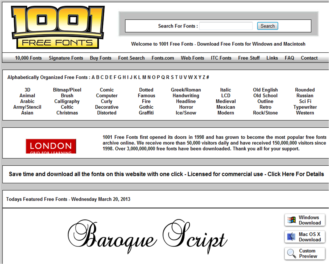
This site is also easy to use, and has clear subheadings which link to pages containing particular styles. Heres an example of the type of page it would link too:

There is a link to download the font in different formats and also a link called 'customer preview' which is a really useful way of seeing how our chosen text will look in that font style:

This is a font we are not likely to use as the italic writing appears very feminine and 'girly', which is not appropriate for our trailer/poster/website, however the rough dappled effect on the lettering is good and connotes an idea of decay or erosion, which we might wish to exploit.
Another website is 100 greatest free fonts: http://www.awwwards.com/100-greatest-free-fonts-collection.html

This site is less userfriendly than the others, so it may not be as good to use. The most noticable difference of the site is that it has no direct links to fonts grouped into different categories and instead the user is meant to scroll down the page till they find a font they like (below) this may make it more difficult to find a font we want to use, however the fonts that the company have are a lot more contemporary and unusual:

As you can see the fonts above are colourful and there are a range of ways they can be displayed, I already found one typography type that we might want to use:

It is simple, but stylish as the letters are elongated and plain, and the rounded corners of the letters i.e the “L” which is not sharp and angled, as it is in most fonts makes the font appear modern and is different from typical typography. Our film trailer, might suit a font with a similar simplistic style, as the title is already unusual “AKELDAMA” so a simple font may work well to emphasise the words.
No comments:
Post a Comment