Showing posts with label Farah. Show all posts
Showing posts with label Farah. Show all posts
Wednesday, 20 March 2013

Saturday, 2 March 2013
Poster Design- initial editing
For the film poster, we have decided to use closeup portrait shots of Akeldama's main characters. This idea was partly inspired by looking at this version of the film poster for Savages (below).

We found the poster grabbed our attention because of:
- The bold use of colour in the typography, a lime yellow which subverts the stereotypical use of red font for a thriller film
- The effect of layering different images was unconventional and worked well, as it draws your focus over the entire poster, rather than a specific section.
- The simplistic text "July 6" is abrupt on the page, and the use of such sparse detail creates a sense of enigma, furthered by the use of no tag line.
- The poster is landscape; this allows for bigger typography, so the title "SAVAGES" can span the whole of the posters width making it more exaggerated, and dramatic.
- The effect of the use of the word "SAVAGES" implies something sinister about the characters in the above closeups. The word connotes primitive behaviour or someone who is uncivilised, juxtaposing the relatively clean cut people shown in the images, with the exception of the two end images where the characters have been mysteriously masked with use of makeup, this is the only clue as to story line of the film.
- The lighting used varies, suggesting possible differences in the characters personalities. i.e. the fourth close up shows a women with bar like shadows across her face- a possible suggestion she will play the villainous role in the film as bars connote jail, or criminal activity.
- Firstly we took a close up shot of each of our characters faces and using the freehand selection tool on Adobe Photoshop, we could separate the background from the image of the person. (the original pictures)
- After this we copied and pasted the images onto PowerPoint:
(character Nyla)

(Character Malory)

(Character Jesse)

(Character Drake) 


This meant that we could layer the separate images on top of one another, too form one image which contained all of the main protagonists, also it made it easier to create a landscape picture by using a power point slide.
3. I saved this into our shared folder, in jpg. form so that as a group we could access it easily and it would be saved as picture rather than as a presentation:


5. It has the basic editing tools; crop, rotate etc. But also has brightness and saturation adjustment, airbrushing tools etc. and is user friendly and easy to use. I started editing, by adjusting the lighting on the pictures, as they had been separate shots some where under exposed in comparison to others. (Below) the results of using a light filter, and increasing the brightness.


Friday, 8 February 2013
Experimenting with editing
We have all begun to edit sections of our film trailer; after having problems with final cut, we are now using imovie to initially edit and then Final cut 10. to finish our edit, as Final cut has better editing software and colour editing features.


One of the things we have edited on imovie, is this timer. We used a timer to create the idea that there is a time limit for the people in our film trailer, and also to connote a sense of pressure- they are runnig out of time. To add the timer we imported a clip of half an hour of a timer, and imovie split this into frames as shown above.
This allowed us to choose different times to include at different points in our trailer, by putting a series of times eventually giving a sense of momentum in the trailer.


Saturday, 19 January 2013
Research for the website
For the website there are some conventions of thriller/action movies to abide by. I looked at a series of websites to see what the conventions would be, below I have shown the main features commonly used in film website, which should help us with our website design.
Typical conventions found:
- Social networking links such as: Twitter, Facebook, Flickr. Which are the most prevalent three I have found.
- Background images linked to the film poster and trailer e.g. pictures (usually close ups or medium shots of the main protagonists or antagonist), or a picture of an iconic scene taken from the film.
- Trailer automatically plays on the opening of the website home page
- Links to a store, shop or gallery page
- Twitter feeds, or a way for fans to interact with the site. Usually run along the side or at the top of the home page
- Critics reviews quoted on the home page
- Tag line of the film
- Animation related to both the genre and individual film
- Any iconic symbols from the film will be displayed on the website i.e. The Hunger Games emblem is an animation on the film's website, and likewise on the SAW website the jigsaw puppet is featured as both are identifiable symbols of the films.
RAMBO WEBSITE:


There are critic reviews, to the right side of the home page, for example the one above mentions Silvester Stallone's well known reputation "STALLONE PROVES ONCE AGAIN WHY HE IS A LEGEMD!" This is a commonly found feature on websites, as using a famous actors name, makes a film appeal to the already excisting fan base of the actor/actors. The use of having good critics review, also gives the audience confidence in the film, and suggests that they are going to enjoy viewing it.


There are links to different pages, offering a store, gallery, and ways for fans to download the film trailer, by givng freebies like this it again increases the fan base and promotes the film to a range of people.


(above) There is rambo inspired animation on the home page, which loads several different times showing animation and graphics linked with scenes from the film, for example it uses the colour scheme, khaki colours and scratch marks connoting the idea of army and survival, which are main themes of the film. If possible, our website design could possibly do a lower tech version of this type of animation.

SAVAGES WEBSITE:

 The trailer beings automatically on entering the website as is conventional for film websites. It is positioned in the middle of the home page, making it prominent and attention grabbing to the audience (above). A feature we will replicate on our own website.
 The title of the film is bold, and prominently placed on the top of the sites home page, as well as the directors name just above the title, as well as the release date of the film and other film information. The typography used for all three is the same using continuity to give the site a more professional look (above).

In the top right corner of the home page there are links embedded to social networking sites, and also to You Tube, where fans can post videos and other links to the trailer. These are important features used on most websites, as film creators want to encourage fan interaction with the site, as this boosts the fan base populous and fan loyalty. We will definitely include social networking links on our film website.
Thursday, 17 January 2013
Typography sources
To look for typography we wanted a font which would be bold and eye grabbing to catch our audiences attention. Because of this we decided against using the traditional fonts found on software such as; word, PowerPoint or Adobe Photoshop and instead looked at a series of online sites.
The first site we looked at was dafont.com: http://www.dafont.com/

(Above) is the homepage for the website as you can see it others a wide range of font styles to choose from, it is also user friendly as each different style has a sub heading to look from which meant that it became popular to work from (below).

Another site which was also helpful and offered an even wider range of fonts was 1001fonts.com: http://www.1001freefonts.com/
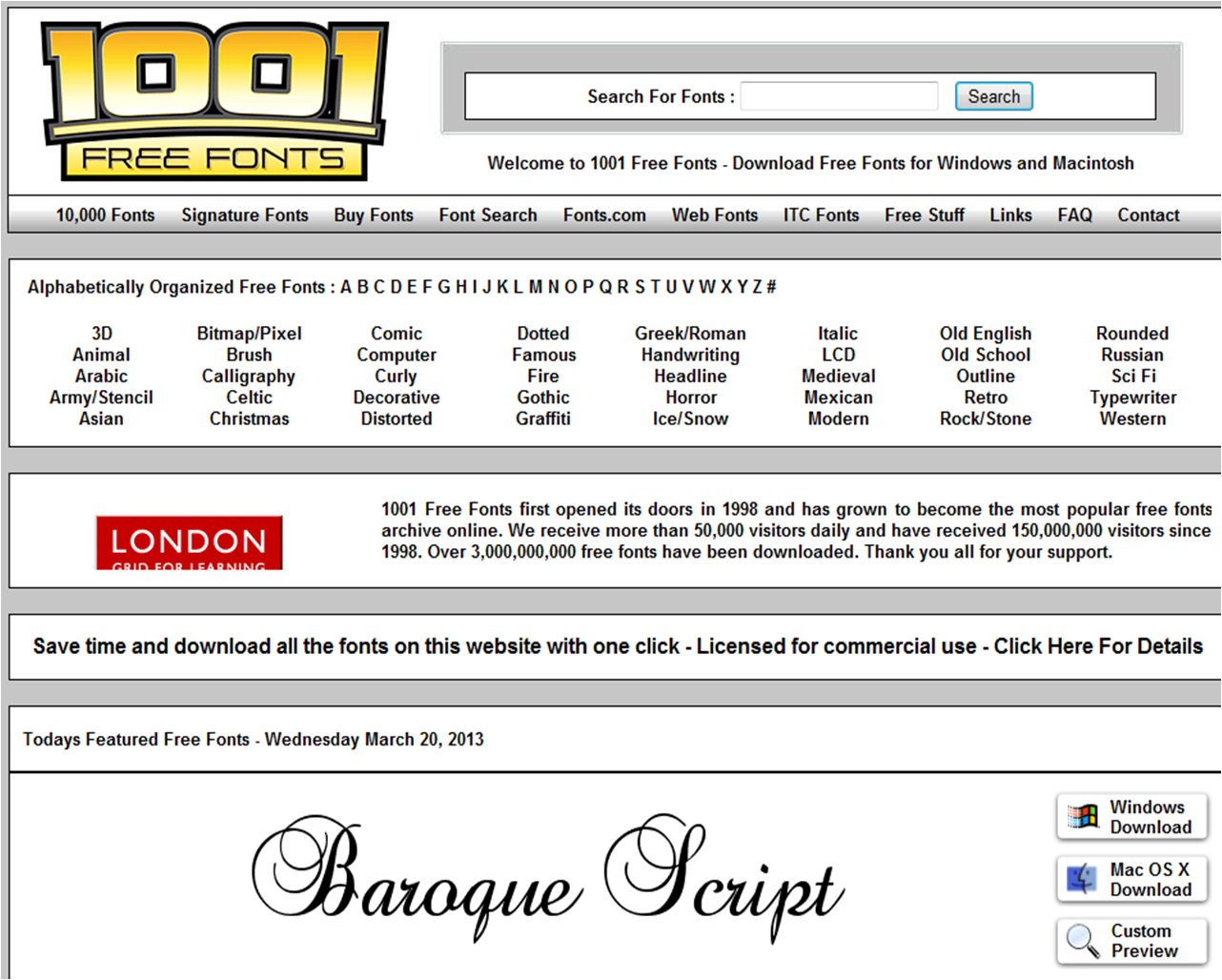
This site is also easy to use, and has clear subheadings which link to pages containing particular styles. Heres an example of the type of page it would link too:

There is a link to download the font in different formats and also a link called 'customer preview' which is a really useful way of seeing how our chosen text will look in that font style:

This is a font we are not likely to use as the italic writing appears very feminine and 'girly', which is not appropriate for our trailer/poster/website, however the rough dappled effect on the lettering is good and connotes an idea of decay or erosion, which we might wish to exploit.
Another website is 100 greatest free fonts: http://www.awwwards.com/100-greatest-free-fonts-collection.html

This site is less userfriendly than the others, so it may not be as good to use. The most noticable difference of the site is that it has no direct links to fonts grouped into different categories and instead the user is meant to scroll down the page till they find a font they like (below) this may make it more difficult to find a font we want to use, however the fonts that the company have are a lot more contemporary and unusual:

As you can see the fonts above are colourful and there are a range of ways they can be displayed, I already found one typography type that we might want to use:

It is simple, but stylish as the letters are elongated and plain, and the rounded corners of the letters i.e the “L” which is not sharp and angled, as it is in most fonts makes the font appear modern and is different from typical typography. Our film trailer, might suit a font with a similar simplistic style, as the title is already unusual “AKELDAMA” so a simple font may work well to emphasise the words.
Friday, 11 January 2013
Shooting schedule: January
The final month of filming! With only a few shots to go January is our last scheduled filming date.

Shooting Schedule no 5:
Crew needed: Summer, Farah
Date: 4th January
Actors needed: Drake (Dani), Della (Farah Speer)
Actor arrival time: 11am am meet at Summer's house
Arrive at Destination: 11 am
Time allocated for makeup: An hour/
Begin shooting: 12 pm
Estimated shooting time needed: Two/three hours
Estimated shooting time needed: Two/three hours
Props needed: Makeup (fake blood and body paint for bruising, wounds etc.) costume and weapons fake rifle.
Lighting: LED lights
Sound equipment: (all)
Sound equipment: (all)
Camera equipment: two tripods, Cannon 550D, Nikon DSLR (for photos)
Thursday, 13 December 2012
Lighting
We had a lot of fun and difficulty with lighting, and used two main types of light whilst shooting:
- Natural Lighting:

Lighting was an important part of our film planning, we required a various array of equipment. As most of our shots were outside we had to depend a lot on getting the timing right for natural lighting.
Using natural lighting, could be tricky as the weather constantly changed, yet it gave some of the best effects, as filming on a cloudy day gave the footage a nice dreary, post apocalyptic feel/effect which can be emphasized in editing.
- Lamps and other lights:

However when filming inside, we also used equipment such as LED lights, which give a strong, hard rimmed light which can fill an entire scene, and which allows us to light from different angles.
For our shoot we have two powerful LED light disks, which are portable and can be used in most locations. They have the option of changing intensity, as they have a switch with three settings which will adjust how many lights on the disc are switched on.
 (Our actor Drake holding the LED discs)
- Light intensity:

Friday, 30 November 2012
Shooting schedule: December
Because of the difficulties with getting actors and crew together on the same day, and also the issues with getting days with similar weather for continuity within shots, we had to do several shoots, below is the schedule for December.
Shooting Schedule no 4:
Crew needed: Summer
Date: 12th December
Actors needed: Drake (Dani)
Actor arrival time: 11am am meet at Summers house
Arrive at Destination: 11 am
Time allocated for makeup: An hour/
Begin shooting: 12 pm
Estimated shooting time needed: Two/three hours
Estimated shooting time needed: Two/three hours
Props needed: Makeup (fake blood and body paint for bruising, wounds etc.) costume and weapons fake rifle.
Lighting: LED lights
Sound equipment: (all)
Sound equipment: (all)
Camera equipment: two tripods, Cannon 550D, Nikon DSLR (for photos)
Wednesday, 7 November 2012
Shooting Schedule: November
To make sure filming is efficient and everyone has a general idea of what's happening I have created a series of shooting schedules, listing what is needed and timings for each day. This is the shooting schedule, for the day(s) of filming.
Shooting schedule no 1:

Shooting Schedule no 3:
Crew needed: Farah, Dani, Beth, Summer
Date: 1st December
Actors needed: Eris (Cleopatra Wood), Nyla (Debbie Voshart), Jesse (Curtis Stewart), Della (Shahira Clea), Malory (Sheng chui)
Time allocated for makeup: An hour/2 hours (Beth)
Shooting schedule no 1:

Crew needed: Farah, Dani, Summer
Date: 17/18th November
Date: 17/18th November
Characters (Actors) needed: Jesse (Curtis Stuart), Della (Farah Speer)
Actor Arrival time: 10:30/11 am
Crew Arrival time: 10/10:30 am
Time allocated for makeup: 30 minutes
Begin shooting: 12 pm
Shooting time (estimation): 2/3 hours
Props needed: Blade, Bow and Arrow
Lighting: Natural light
Camera equipment: Tripod, Cannon 550D, Nikon DSLR
Sound equipment: Mic, Headphones
Shooting Schedule no 2:
Crew needed: Farah, Dani, Beth, Summer
Date: 1st November
Actors needed: Della (Farah Speer)
Actor arrival time: 11am am meet at Summers house
Arrive at Destination: 11 am
Time allocated for makeup: An hour/2 hours (Beth in charge of makeup)
Actor Arrival time: 10:30/11 am
Crew Arrival time: 10/10:30 am
Time allocated for makeup: 30 minutes
Begin shooting: 12 pm
Shooting time (estimation): 2/3 hours
Props needed: Blade, Bow and Arrow
Lighting: Natural light
Camera equipment: Tripod, Cannon 550D, Nikon DSLR
Sound equipment: Mic, Headphones
Shooting Schedule no 2:
Crew needed: Farah, Dani, Beth, Summer
Date: 1st November
Actors needed: Della (Farah Speer)
Actor arrival time: 11am am meet at Summers house
Arrive at Destination: 11 am
Time allocated for makeup: An hour/2 hours (Beth in charge of makeup)
Begin shooting: 12 pm
Estimated shooting time needed: Two/three hours
Estimated shooting time needed: Two/three hours
Props needed: Makeup (fake blood and body paint for bruising, wounds etc.) costume and weapons (all).
Lighting: LED lights
Sound equipment: (all)
Sound equipment: (all)
Camera equipment: two tripods, Cannon 550D, Nikon DSLR (for photos)
Shooting Schedule no 3:
Crew needed: Farah, Dani, Beth, Summer
Date: 1st December
Actors needed: Eris (Cleopatra Wood), Nyla (Debbie Voshart), Jesse (Curtis Stewart), Della (Shahira Clea), Malory (Sheng chui)
Actor arrival time: 10:30 am meet at Woolwhich station
Arrive at Destination: 10:45Time allocated for makeup: An hour/2 hours (Beth)
Begin shooting: Dependent on arrival time
Estimated shooting time needed: Three/Four hours
Props needed: Makeup, body paint, eyeliner for wounds and scratches (fake blood etc.) costume and weapons (all).
Lighting: n/a
Sound equipment: (all)
Camera equipment: two tripods, Cannon 550D, Nikon DSLR (for photos)
Location Research- finding the right location
One of the most important issues we are facing is finding a location we want for the film trailer, and one that we are allowed to film at, we have all been researching a lot into this as it is a key element and we can't film until we find a location.
Location scouting-

- The grade II listed building is large and the outside has been not that well maintained, meaning some of the paint has peeled away, giving the idea that the house has not been cared for or has been deserted.
- Because of its large size it has a grand feel to it, and our group were considering using it in an opening scene to show an idea of wealth and power.
- The building is painted white, allowing us to play on connotations of innocence, purity- which are idea typically played on in the thriller/horror genre.
- The building is surrounded by large grounds which give it an air of isolation, and there are old dead trees surrounding the house- which give it an eerie, creepy atmosphere.
Inside

- The idea of wealth and power is juxtaposed when you look inside of the building, as the inside is unfurnished and predominately empty, we could use this to demonstrate that there has been some sort of financial crisis which has led to people leaving.

- There is however still a sense of grandre as the place is impressively large inside, however the inside is darkly lit, and relies only on natural sunlight, making the place slightly creepy, ideal for a thriller film location.
- There is a huge chandelier still hanging in a old dining hall, which suggests an earlier time of wealth and also again reiterates the idea of abandonment.


- Another characteristic feature of the house, is the staircase which would enable us to play around with levels, and angles i.e. it is a good landing space for a high angle or birds eye shot, as (shown in the below picture)

- Underneath the house: is a large cellar.
- This would provide a good shooting location, for a scene showing people hiding.
- Or if we want to explore the idea of people living in captivity or being held against their will, we could exploit the connotations of entrapment that are commonly associated with basements or underground spaces.
- The lighting in the cellars is entirely artificial- allowing for the possibility to completely control and filter the type of light we think would be most effective for our film and allowing us to experiment with using different lighting intensity levels.

- The location offers a number of out houses
- The benefit of having the outhouses is; they look quite rural and rustic so connote simple living, this means they contrast to the Grander of the rest of the outdoor space. So we could use them too possibly to demonstrate class, or social boundaries.

- It also has a lake- traditionally used in films either to represent danger (conventionally within thrillers lake’s are where unstable protagonists are found drown and thus create an enigma or they are used to show luxury and indulgence.
Wednesday, 24 October 2012
Mise en scene research-Weaponry
For our film trailer weapons are essential props, as it is focusing on the idea of survival, and is an action/thriller trying to show the extremes of human nature, therefore will most likely contain scenes of violence and brutality.
The weapons we are considering are fire arms, blades, machetes etc.
In this blog post I’m looking at different types of blades and even items found in the shed that could be used as weaponry.
The first weapon that could be used is- a pitch fork.
 The use of a pitch fork suggests to me the idea of desperation and gives a sense of gritty realism- as it is plausible that in a situation where you’re life is threatened that you could use even normal household objects in defence of yourself.

Connotations of the pitch fork are interesting, as they are traditionally associated with the idea of hell or Satan, with the devil traditionally being drawn as a red demon who wields a pitch fork as an object of torture.
 This could work well for Alkedama as we can play on the pre-existing negative media image of a pitch fork. It will also be fees able to source a pitch fork, unlike some other weapons, so this would make the use of the weapon more practical for our group.
The next weapon- The traditional blade knife

Blades have always been traditionally used as a weapon in films, as it readily connotes an air of menace and danger. It is recognisably a weapon, unlike the pitch fork, and we can use a variety of blades. In the research i have done into films such as Arena and hunger games, blades have typically appeared as a choice of weapon- so using them will help us to in keep with convention.

The character we were thinking to give this prop would be Eris as her character has a sadistic side, which would work well with this type of weaponry, as a blade being wield implies fatality and death, so use of this mise en scene will help reflect this aspect of her nature.

The character we were thinking to give this prop would be Eris as her character has a sadistic side, which would work well with this type of weaponry, as a blade being wield implies fatality and death, so use of this mise en scene will help reflect this aspect of her nature.
The third weapon- The Saw

(Chainsaws, would be useful as the sound- a metallic, groaning type noise- instantly signals to audiences something threatening, and we could overlay this sound onto our film- connotations eerie, foreboding, imagery of violence is connected with the image of a chain saw).

Saws are great weapons to use, as they could easily be found in a home, and if we are playing on the idea of our characters being so desperate they would use anything and everything to defend themselves, a saw is perfect. Saw's are traditionally a tool, but now have the media image of a dangerous weapon since modern films, such as SAW so we can exploit this new stereotype.
Arena (2011): Three scenes deconstruction
The storyline of arena is similar to our own, as it also explores the concept of killing to survive and the idea of the public being sick. The plot is; their is a website called Death Games, which shows real fights for the death- the main protagonist David Lord looses his wife, and so ends up falling into alcoholism. When drinking in a bar, he picks up a woman, who tasers him and kidnaps him, he then is held captive and forced to kill others to survive. As the plot of this film, holds many similarities to our own film trailer I thought it would be a good source of inspiration, too look at how the film shows the idea's of brutality, violence and desperation- each elements we're hoping to depict.

The first scene that is particularly relevant, is a scene showing the capture of the main protagonist David Lord, first waking up and realising he is trapped.
- Mise en scene-
- There is a chain around David's neck- the position dehumanises him, it is positioned like a colour the use of the chain connotes a lack of authority and power and reflects the idea that his life is now in the hands of his kidnappers. (Close up on protagonist below)
- He pushes against the chain's resting his whole weight on his neck- shows his characters determination and strength to be free (traits which our film trailer will show).
- Bars- Like prison bars, reflects idea of being trapped, caged again adding to the idea he is being dehumanised.
- On the other side of the bars sits the woman who captured him- giving her a sense of authority- she is in charge now. A key shot showing this is this wide framed close up shot (below)
- Her calm exterior (facial expression); reflecting she is used to this type of thing and she seems unbothered- suggests to the audience-she lacks morals.


- Sound-
- Metallic clang/bang noise of Davids chains as he struggles to free himself- furthers the idea of his captures strength.
- Main female protagonists soft tone of voice- "Do you want me?" subverts the stereotype of violence being something macho, and shows how she still exploits her sexuality in such a high tension situation.
- Growling noise coming from David- again using animistic behaviour, to reflect the lack of humanity within "Arena".
Second scene selected:
The second scene I've selected is the main fight scene, which shows the brutality of the games, and is the part which relies most heavily on makeup and costume.
Mise en scene:
- Weapons- Each character is forced to pick up a weapon- blades are provided and the weapons grow worse as the fights progress ending with nail guns and death by impalement.
- Blood- heavy use of blood and gore- makeup has been used cleverly to show, deep skin wounds (for example one crossing over the main protagonist's right shoulder).
- There is blood splatter on David's face reflecting his first kill- and loss of morality.

- The style of the fight is oriental- playing on the traditional Korean/Japenese slasher format.
- Costume- David and his opponent both wear traditional martial art style clothing.
- This cleaner version changes as in another fight he is shown wearing traditional gladiator style dress- for example- leather breaches, and chest plate.


Third scene:
This scene i've selcted depicts the public watching the fights at home- adding to the idea that the public are sick.
- Mise en scene-
- Computer screen in high school bedroom (shown in close up shot), suggests that college students are watching it.
- The words "Death Games" appear on scream, and two male characters (un-named) high five each other shows their excitement for the game.
- The two guys have invited all their friends to view the show and in the background (long shot) is a banner reading "DEATH GAMES" - implying their anticipation for the fight.
- Cups of drinks, and food being passed around- similair to a viewing at a cinema shows the lack of care people have concerning the actual fighter's to them it is just 'entertainment'. We hope to explore this idea in Akeldama.
Sound-
- Narrative- "This is gonna be sick!" two male characters, at computer screen suggests their enjoyment again.
- Roar of excitement- loud noise, gives the idea of group mentality- they have all grown to enjoy the games, in comparrison to an earlier scene where two girls watching it seemed to be sickened by the blood an violence (suggests this is becoming the norm).
Subscribe to:
Posts (Atom)