Showing posts with label Typography. Show all posts

Tuesday, 19 March 2013

Creating the typography

When making the typography, the first thing I had to do was find a base font that I wanted to start working from.  From our past research we decided on the font Bloody impact.

To create the typography I will be using Adobe Photoshop. After creating a background layer and colouring it black, I added an additional adjustment layer to add the text to invert the colour.  


I then edited this text layer by adding adjustment layers to add drop shadows, inner shadows, bevel and emboss, stroke and gradient overlay following the colour scheme of gold and blue.


I then added a duplicate text layer just below the original text layer which created the effect of a whole text shadow.

By cutting out the text and making the background transparent, the typography was therefore transferable to our 3 media products.


Tuesday, 29 January 2013

Typography

I have been looking at different posters to see which typography is best suited for our Akeldama. I have been looking at exiting posters for similar themed films to see how they have continued the theme in the typography and have tried using similar fonts to them.


The writing on the poster for The experiment' is based on army stencilling. 'Death Race' uses a font more based on that found in racing video games but still has be worn away to resemble an old stencilled sign. 


 This is a solid stencilled font. 
The bottom font it more directly based on army stencilling.


This is also a solid font that we were first considering, as it looks gritty and distorted. However, this is more suitable for a horror/sci-fi genre rather than a thriller, therefore, we are not going to be using this font.


Thursday, 17 January 2013

Typography sources

To look for typography we wanted a font which would be bold and eye grabbing to catch our audiences attention. Because of this we decided against using the traditional fonts found on software such as; word, PowerPoint or Adobe Photoshop and instead looked at a series of online sites.

The first site we looked at was dafont.com: http://www.dafont.com/


(Above) is the homepage for the website as you can see it others a wide range of font styles to choose from, it is also user friendly as each different style has a sub heading to look from which meant that it became popular to work from (below).


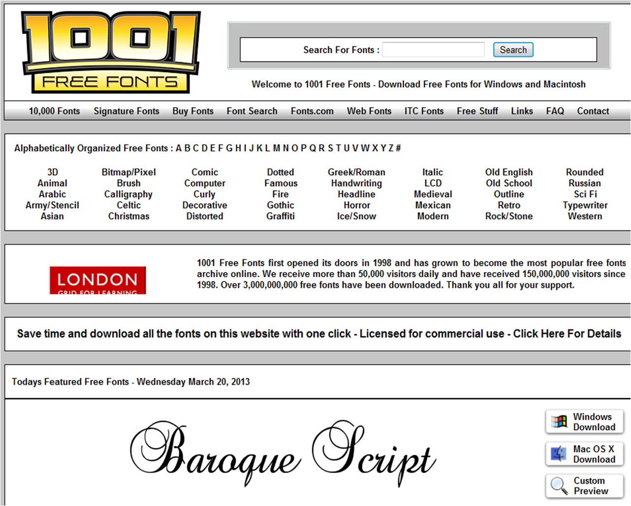
Another site which was also helpful and offered an even wider range of fonts was 1001fonts.com: http://www.1001freefonts.com/


This site is also easy to use, and has clear subheadings which link to pages containing particular styles. Heres an example of the type of page it would link too:


There is a link to download the font in different formats and also a link called 'customer preview' which is a really useful way of seeing how our chosen text will look in that font style:


This is a font we are not likely to use as the italic writing appears very feminine and 'girly', which is not appropriate for our trailer/poster/website, however the rough dappled effect on the lettering is good and connotes an idea of decay or erosion, which we might wish to exploit.

Another website is 100 greatest free fonts: http://www.awwwards.com/100-greatest-free-fonts-collection.html


This site is less userfriendly than the others, so it may not be as good to use. The most noticable difference of the site is that it has no direct links to fonts grouped into different categories and instead the user is meant to scroll down the page till they find a font they like (below) this may make it more difficult to find a font we want to use, however the fonts that the company have are a lot more contemporary and unusual:


As you can see the fonts above are colourful and there are a range of ways they can be displayed, I already found one typography type that we might want to use:


It is simple, but stylish as the letters are elongated and plain, and the rounded corners of the letters i.e the “L” which is not sharp and angled, as it is in most fonts makes the font appear modern and is different from typical typography. Our film trailer, might suit a font with a similar simplistic style, as the title is already unusual “AKELDAMA” so a simple font may work well to emphasise the words.

Monday, 19 November 2012

Photoshop practice

I have never really used Photoshop and so I thought it would be a good idea to practice layering images and looking at what I could do before we make the typography for the film and before we start making the poster. Below is a test of how to layer two basic images. 


I layered the image of the zombie below over the image of a university lobby. This is the sort of thing we will be doing in the poster I think so its a good thing to practice. 


I layered the image over and then used the eraser tool to remove the background of the field and blend the image in. It was really simple so I think it will be good to use on the poster.

Monday, 15 October 2012

Typography

I chose a selection of films from the same genre Action thriller, ranging from extremely recent to a decade ago, to look at the conventions for thrillers/action film typography, that we could take inspiration from. Looking at some of the film posters, of iconic films such as "Rambo" and trailer typography from films such as ''The Hunger Games'' provided our group with key ideas and a template from which to design our own typography from.

Conventions of film poster typography:

  • Colour scheme reflective of genre (for example red and black for a poster for a horro film)
  • Different size fonts
  • Font colour either contrasting or matching background
  • Bold lettering is often used to seperate the title from tag line
  • Editing effects used to reflect the plot in the typography for example in the film poster for "AdULTHOOD" the letter d is left in lower case; as though the words have been written in a hurry or as a mistake- ironic as the word "adulthood" suggests maturity, but the mistake seems childish and the film explores this.


  • Another example is commonly found in horror films, often the typography has the appearence of a scribble dripping blood- hinting at death and killing later in the plot.

Poster Typography


  • The main font colour used is a silver, metallic colour which is parallel to the idea and images of weaponry used.
  • The background font colour- is a deep crimson, connoting blood, violence, anger and passion, adding to the idea of the film being in keeping with action genre.
  • The red is positioned from behind the silver front, it seems to seep from out of the silver- reflecting a blood splatter, building up more of an image/idea of violence and brutality.
  • The font also parallels to this idea, as the edges of the font are pointed and sharp giving an appearance similar to blades, mirroring the image below, this style of font is un-conventional for this genre as silver, is used commonly as in the sci-fi genre typography.
  • Famous actors names- are used as means of promotion, running along the top of the film poster- the font used is smaller, a similiar but more simplistic font- drawing the viewers attention without overshadowing the typography of the title.
  • The colour white has been used for the smaller font- inverting the typical connotations of white being used for purity, and good.

  • Again the font colour used is a red- this time a bright red, instantly catching the audiences attention, as it contrasts brightly against the gritty, dark lighting of the background image (featuring the main protagonist).
  • The vibrancy of the red colour and the use of bold lettering makes the words "RAMBO" hugely emphasised creating a sense of importance- as Rambo is a name, this creates a sense of power and authority.
  • Creating a pre-eminence to the figure of "Rambo"- from the poster and use of typography we can infer he is strong and fearless.
  • The typography varies in size, using the larger of the font to highlight the title of the film, and the smaller font as an advertisement promoting the famous  name "Stallone".
  • The smaller font is a shade darker, giving it less emphasis but still connoting a presence of power and a sense of anger, in parallel to the serious expression worn by the main protagonist above.
  • The title is centered on the film poster just below the main protoaganist's eyes- this draws the viewers attention.


  • · The use of typography in this film poster is subtle, blending into the background (creating a shadow like effect) - gives a sense of mystery.
    · Used against the dark background there is inference of setting- the black being traditionally a symbol of the night etc.
    · The way the writing merges within the shadows, almost reflects that it is the words of the protagonist, as it's subtle colour implies menace, the use of silver being generally used to mirror a weapon (sword, knife etc.)
    · The typography is paralleled to the main protagonist, whose image is centred within the text- this suggests the idea of boundaries- he is the thing standing in your way.
    · The use of lighting of the picture also is used in parallel to the typography, as the lighting is subtle and over head (illuminating only certain parts of the protagonist i.e. his face and hand on the gun, shrouding the rest of him in shadow). - Enigmatic, tense.
    · The title of the film "TAKEN" is written in orange- the use of bold and vibrant colouring making it set apart from the rest of the font, the "T" is half covered by an image of a gun (connoting violence, danger and giving hint to the use of weaponry used in this film, conventional for an action/thriller).


  •  Layout- Positioned in the top right corner of the film poster is famous actors names- using their fame to attract an audience.
  • The use of the bright red font colour is a typical feature in most of the film posters I have analysed, and is used again here to connote violence, but also used to subvert the word children who are innocent and pure.
  • As well as this the use of the colour's red and white make the font stand out from the darker background- drawing viewers attention.
  • The font appears elongated as though being stretched- could be representing strain or pressure felt by the characters?
  • The concrete background is synthetic/manmade and harsh, making the font seem more threatening.
  • The font varies in size making emphasis on different key word, for example "MEN" is capitalised and boldened.

Trailer Typography

  • This typography from the film 'Exam' is shown as alarm-clock timer digits which is completely relevant to the countdown decreasing as the exam goes on. 
  • The colour is red which has negative connotations of danger, blood, death, destruction and dominance which are all represented in some way in the trailer and film. It suggests that the film is all about these connotations and creates enigma into finding out how these connotations are represented.
  • It clearly suggests that the film is a thriller/horror because of the use of red and black colours and the timer-like typography. 
  • The vibrancy of the red stands out and suggests that the 'exam' is powerful and dominant in the film. The exam has authority over the candidates themselves.
  • The background is a very simple black colour which has negative connotations of power, dominance, mystery and enigma, which again, are represented fully in the trailer and film by the dominance of the guard and invigilator, and the mystery of not knowing what the question in the exam is. 
  • The very simplistic and reductionist form and layout gives the effect of isolation and space around the centre title. 


  • The typography of the title is very plain and simplistic as the letters are in capitals and in the colour black. Black has connotations of death, destruction and power which relates to the film and is something we are looking to show in our typography too.
  • The title overlays the Hunger Games logo which stands out and contrasts from the title. The logo is set alight and involves shades of oranges and yellows which connotes fire and destruction. 
  • The bright fire indicates danger and harm which contributes to the typography text connotations of darkness and dullness.
  • The title is set in the middle of the screen which stands out and can be easily memorable to the viewer. It is in the centre view which catches the viewers eyes first.
  • The fire gives a sense of enigma and will attract the target audience of anyone who likes the genre. 
  • The fire is also animated (moving flames), giving the sense of realism and has a bigger impact on the audience.