Showing posts with label deconstruction. Show all posts

Tuesday, 5 March 2013

Sound deconstruction - Urban action trailers

I am going to look at genre ideals surrounding the sound of action trailers to find the main themes, to then decide whether to conform to, or subvert these in our trailer


The Bank Job:
- Snippets of dialogue from within the film (diegetic)
- Backing track with strong bass and drum beat.
- Editing matches and compliments music
backing track louder with important pieces of typography to emphasise them.
- Additional sound effects of cameras clicking etc.
- Song changes to more upbeat and playful
- Use of comical lines


Fight Club:
- Internal dialogue from film
- Comical lines straight away
- Commentary explaining plot
- Quiet backing track behind all of the dialogue.
- Mostly diegetic sound throughout
- Sound track only picks up right at the end
- Although quiet, the backing track song still has a strong bassline and drumbeat.


SWAT:

- Extremely heavy baseline and drum beat, kicks in straight away.
- Diegetic dialogue is played over the top of this soundtrack - legible but inconvenient. 
- Additional sound played throughout -- gun shots etc.
- Comical lines heard throughout
- Dialogue used as a voiceover to explain plot


Tuesday, 6 November 2012

Deconstruction - the woman in black teaser trailer


Mise en scene
  • ·      The opening of the trailer shows old Victorian toys in an abandoned house. The lighting is dim and is unnerving for the audience as we cannot really see what the situation is - we are immediately shown that this is a trailer for a horror film. The trailer is unnerving rather than gory however so we can assume it is going to be a supernatural or psychological horror film (from the rest of the trailer we can gather it is a mix of both).
  • ·       The use of children in the trailer is a new stereotype of horror films - usual conventions of childhood is innocence and purity but horror films, such as the woman in black, use the unnerving image of a child who acts as an adult to unsettle audiences. 
  • ·      The lighting is used very well to add to the Edwardian mise en scene to create the horror genre atmosphere. Grey filtered natural lighting is used when outside to give a sense of being in a desolate place - the place is big but there is very little there. 
  • ·      The dark candle lighting inside the house is used to create a sense of the unknown- there is a constant enigma of what is in the house as we can see very little of the location- the dim lighting and the dark tailored clothes of our hero mean that in some shots we can see very little apart from his pale face. 


Sound
  • ·      There is very little sound with only the diegetic chiming of the old ‘musical monkey’ toy and the little girl talking non-diegetic voice-over; this creates the atmosphere for the audience and subsequently makes the audience easier to ‘make jump’ as we are having to focus very closely on the trailer to hear. 
  • ·      The rhyme used in the trailer is specifically written for the film - it creates the illusion that this is a real folk story that the villagers made songs of warning about; this is also shown through the use of the scratched photographs showing the ghost in the window such as you might see on a real documentary.
  • ·      The little girl’s voice is unnerving for the audience to hear a child talking about such a scary concept and the mature tone of the little girl’s voice is most unsettling because it subverts the media representations of children being ignorant to such horrors.


Editing
  • ·      The chiming of the child’s toy also is used really well to align with the cuts between the clips of the film- with each chime the screen goes black and then shows a very short clip of the quicker, I assume later parts, of the film without revealing the plot. 
  • ·      The panning shots are used well at the beginning of the trailer in contrast to the quick jump cuts later to create dis-equilibrium - the audience is given a sense of how the film will be in terms of how it will be based mainly around the anticipation of a ‘jump’. 
  • ·      The final, slower shot of the man looking out the window uses very little editing to create tension and anticipation for the ‘jump’ - after seeing the rest of the trailer we know this is a horror film and so the audience anticipates something happening. The woman appearing behind the man makes the audience unsettled and intrigued by the film as we cannot gather from the trailer what the real plot is. 
  • ·      The typography is linked very well the rest of the trailer. It is designed to look like someone/something has scratched into the glass. It is in a very old fashioned text to indicate this is a costume horror. It is similar to the font used on when the man finds the message ‘you could have saved him’ on the wall in blood and is shown at the window we immediately before saw him looking out of to show the audience that this is the main location of this film. 

  
Camera angles
  • ·      The eye-line shots create the sense we are actually in the situation with the hero of the film. This is appropriate for this genre particularly because most horror films aim to make the audience feel in the same situation as the victim - e.g. we do not see something until they do. This is directly linked to identifying the intended audience as viewers can clearly see this is going to be a classic psychological ghost story and will entice fans of this genre.
  • ·      Low and high camera angles are used throughout to give the sense that the character is being watched – these create an unsettled atmosphere as the camera angle implies that the character is not alone.

Gamer (2009) poster deconstruction

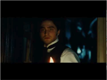
·         This film poster would be great inspiration for our film.
·         The background image of one man (the main protagonist) is shown which builds tension amongst the viewers.
·         The protagonist is looking directly at the audience, giving eye contact. This involves the audience and brings them into the film themselves, making them want to watch it.
·         The protagonists face is shown being distorted as the middle of his face is seen to have been smashed in the centre, forming a vertical jagged line down his face. This could represent two sides to this characters’ personality or that this character is on the verge of breaking down, or is being ‘broken’ by someone or something else. This could also indicate that the outside of his face represents one personality, whereas the small face that is ‘trying to get out’ of the black and white face is his contrasting personality. He could be trying to be someone else on the outside, whilst hiding his true personality underneath.
·         The colour scheme of the background is shown in black and white
·         The typography of the title is shown in block capitals and in the colour red. The colour red has negative connotations of blood, danger, death and destruction. This gives an ideal representation of the film itself, relating back to its genre of thriller.
·         The title is shown near the bottom of the poster, centred. This allows the audience to move their eyes around the poster, whilst also looking at other things shown on the poster, which also allows the viewer to get the image of the poster in their head, making it more memorable.
·         The tagline is shown directly underneath the title which also allows the audience to manoeuvre their eyes to find it, whilst looking closely at the whole poster.
·         The tagline is shown also in block capitals, mirroring the font of the title above. The colour is white which juxtaposes the genre of thriller to give a sense of innocence that this character and film might also represent – we have to watch it to find out how the innocence is portrayed.
·         The tagline is also shown as a question. This question is directed to the audience that is looking at the poster. It involves the audience so that they feel like they are part of the film themselves, therefore, making the audience want to watch the film.
·         At the very top of the poster, centred, is the main protagonists name shown in block capitals and also in red, which suits the scheme of the poster and relates to the thriller genre. This would also stand out and grab this actor’s fans’ attention, giving the film more popularity.

Wednesday, 24 October 2012

Arena (2011): Three scenes deconstruction

 
The storyline of arena is similar to our own, as it also explores the concept of killing to survive and the idea of the public being sick. The plot is; their is a website called Death Games, which shows real fights for the death- the main protagonist David Lord looses his wife, and so ends up falling into alcoholism. When drinking in a bar, he picks up a woman, who tasers him and kidnaps him, he then is held captive and forced to kill others to survive. As the plot of this film, holds many similarities to our own film trailer I thought it would be a good source of inspiration, too look at how the film shows the idea's of brutality, violence and desperation- each elements we're hoping to depict.


First Scene chosen:

The first scene that is particularly relevant, is a scene showing the capture of the main protagonist David Lord, first waking up and realising he is trapped.

  • Mise en scene-
  • There is a chain around David's neck- the position dehumanises him, it is positioned like a colour the use of the chain connotes a lack of authority and power and reflects the idea that his life is now in the hands of his kidnappers. (Close up on protagonist below)
  • He pushes against the chain's resting his whole weight on his neck- shows his characters determination and strength to be free (traits which our film trailer will show).
  • Bars- Like prison bars, reflects idea of being trapped, caged again adding to the idea he is being dehumanised.
  • On the other side of the bars sits the woman who captured him- giving her a sense of authority- she is in charge now. A key shot showing this is this wide framed close up shot (below)
  • Her calm exterior (facial expression); reflecting she is used to this type of thing and she seems unbothered- suggests to the audience-she lacks morals.


  • Sound-
  • Metallic clang/bang noise of Davids chains as he struggles to free himself- furthers the idea of his captures strength.
  • Main female protagonists soft tone of voice- "Do you want me?" subverts the stereotype of violence being something macho, and shows how she still exploits her sexuality in such a high tension situation.
  • Growling noise coming from David- again using animistic behaviour, to reflect the lack of humanity within "Arena".
Second scene selected:

The second scene I've selected is the main fight scene, which shows the  brutality of the games, and is the part which relies most heavily on makeup and costume.

Mise en scene:
  • Weapons- Each character is forced to pick up a weapon- blades are provided and the weapons grow worse as the fights progress ending with nail guns and death by impalement.
  • Blood- heavy use of blood and gore- makeup has been used cleverly to show, deep skin wounds (for example one crossing over the main protagonist's right shoulder).
  • There is blood splatter on David's face reflecting his first kill- and loss of morality.


  • The style of the fight is oriental- playing on the traditional Korean/Japenese slasher format.
  • Costume- David and his opponent both wear traditional martial art style clothing.
  • This cleaner version changes as in another fight he is shown wearing traditional gladiator style dress- for example- leather breaches, and chest plate.


Third scene:
This scene i've selcted depicts the public watching the fights at home- adding to the idea that the public are sick.
  • Mise en scene-
  • Computer screen in high school  bedroom (shown in close up shot), suggests that college students are watching it.
  • The words "Death Games" appear on scream, and two male characters (un-named) high five each other shows their excitement for the game.
  • The two guys have invited all their friends to view the show and in the background (long shot) is a banner reading "DEATH GAMES" - implying their anticipation for the fight.
  • Cups of drinks, and food being passed around- similair to a viewing at a cinema shows the lack of care people have concerning the actual fighter's to them it is just 'entertainment'. We hope to explore this idea in Akeldama.
Sound-
  • Narrative- "This is gonna be sick!" two male characters, at computer screen suggests their enjoyment again.
  • Roar of excitement- loud noise, gives the idea of group mentality- they have all grown to enjoy the games, in comparrison to an earlier scene where two girls watching it seemed to be sickened by the blood an violence  (suggests this is becoming the norm).


Tuesday, 23 October 2012

Woman In Black (2012) Poster deconstruction


  • The typography is very ghostly which relates to its horror genre. It is like chalk-esque fading white font which is immediately noticeable to the eye and provides a sense of eeriness and supernatural being to it.
  • The tagline asks ‘Do you believe in Ghosts?’ This gives a clear idea that the film is based on the supernatural and addresses the audience directly and makes the audience feel involved.
  • Well known actors name, Daniel Radcliff, is shown on the poster contrasting to the black background which makes the text stand out and attracts the actor’s fans.
  • The text has an eerie feel which suits the genre of the film. It is shown in white who is also ghostly. It is also shown in a light blue tint which insinuates negative connotations of cold and ice.
  • The same colours blue and white are merged into the colours of the main protagonists eye in the poster, which insinuates that this character may have some ghostly past in him too.
  • An obscure image of an eerie face is subliminally hidden and distorted in grainy monochrome colours. This adds a sense of enigma/mystery within the film. The face has dark circles in replace of eyes so we cannot see who or what this is which also adds to the enigma of the film.
  • Image of Daniel Radcliff shows direct eye contact with audience making them feel involved and shows he is a dominant character in the film. 


Terminator Salvation (2009) poster deconstruction


  • Plays on the conventions of the golden rule. The main image of the skull is in the middle, but upside down. This allows the audiences eyes to move and manoeuvre around the poster in order to come to grips with what the image actually is, whilst looking around at the whole poster taking in all the information such as the release date, the title and the actors in it.
  • The eyes of the skull are the main focus. The colour red is illuminated and lit up which is suggesting that the skull is ‘still alive’.
  • The red has negative connotations of danger, pain, death and destruction. The red contrasts to the overall background colour scheme of brown, black and cream – natural. This makes the red stand out and eye-catching to the audience, relating to the horror thriller genre.
  • The background illustrates a fight, destruction scene which gives away that the film is about action.  This imagery links to tagline ‘We fight back’ which also relates back to the genre of the film.
  • The typography is very metallic, robotic, futuristic and artificial. We can take this as inspiration as it would be a great look on our typography.
  • We can see thick, dark grey/brown smoke emerging from the mechanical works of the skull body, which relates back to the metallic/futuristic feel and industrialisation. This adds to the action of the film relating back to its genre. 


Friday, 19 October 2012

Deconstruction: Saw Trailer (2004)

Trailer deconstruction looking at the film SAW:


  • Opening: Opens by zooming in on a medium shot of television screen with the jigsaw puppet saying, “I want to play a game…” The voice used is a man’s voice, but sounds as though a voice generator has been used, creating a deeper, and hoarse tone. Making the puppet figure appear more eerie, and mysterious.

  •  Mise en scene: Using the puppet plays on the connotations of childhood- a child’s toy; giving a sense of innocence and fun, however this is subverted as the puppet is being used in a way which is menacing and threatening.

  • The puppet’s face has extremely prominent cheek’s, and large, expression less, circular eyes giving it a twisted, deformed like quality. This tells the audience that this is not a children’s film, and creates a sense of foreboding, what kind of ‘game’?

  •  On the puppets cheeks are two red bulls eye symbols, using the conventional colour red connotes blood, gore and violence to the audience. The use of bulls eye symbols, suggests the idea of a ‘target’ being a feature in the film.

  • The message is shown on an old television, this gives the image a grainy appearance, which further distorts the puppets face, increasing the feeling of menace.

  • The television is propped on what appears to be a scratched wooden box, possibly suggesting that the message is not being screened in someone’s home. Creating an enigma, who’s watching this and where?

  •  On top of the television is what appears too be two images; enigmatic again, who or what of?


  • Following the medium shot is a montage of newspaper clippers run at high transition speed.
  • The newspaper clipping give information to the audience; informing them that a number of killings have taken place.
  •  And that Jigsaw is the nickname for a serial killer.
  • This gives information to the plot, stereotypically creating an enigma through using an unsolved crime case.
  • The idea of a serial killer connotes to the audience, danger and violence- building up suspense within the trailer.
  •  Voice over- “The jigsaw killer” is embedded over the top of the clippings, emphasising that jigsaw is a threat/danger.


  • After the montage, a slide has been edited in.
  • Typography: “IT’S HIS GAME” written in bold white lettering, the use of white holds connotations of innocence, purity and good which are being subverted in this context. This is a typical feature in the thriller/horror genre as there is something uncomfortable by creating evil where we expect there to be good.
  • The edges of the font are blurred, giving them a similar appearance to fog or smoke.
  • The background is mainly plain black, but in the bottom right corner is a white blur, like breath on glass, creates the feeling of being under surveillance.


  •  A long shot follows.
  • The shots is grainy quality; stolen from a surveillance camera?
  • Creates idea that Jigsaw is constantly watching- appearence of CCTV footage.
  • Audience: feel on edge.
  • Jump cuts to man on bathroom floor.
  • “Technically speaking, he’s not really a murderer, he never killed anyone. He finds ways for his victims, to kill themselves”-  Diegetic narrative creates a twist in the plot, audience now understand “Jigsaw” is more complex than first thought, he’s going to test his ‘victims’ and perhaps torture them.
  •  Gives more of an impression that ‘Jigsaw’ is cruel, and enjoys playing around with victims, is it more of a game to him?

 
  • Another long shot is used- of whom?
  • Costume is used here to make the character mysterious/enigmatic; the character sports a long black cape; which traditionally holds connotations of death or evil- the grim reaper in general media images is dressed in a black cloak, stooped over like in this picture

  • Mise en scene: There are industrial overhead lamps and wire fencing suggesting the location is an underground warehouse or car park.
  • Coming from behind the dark figure, is smoke or steam- furthering the sense of foreboding and tension as smoke connotes flame, and fury, which are traditionally linked to hell and retribution.

  • The voice of the jigsaw puppet is used in a voice over “Doctor Gordon” is he naming his next victim as following this is close-up shots on two middle aged men, one of which possibly being Dr Gordon?

  • A feeling of fear is created, heightened by the screen going to black out and the voice of Jigsaw “Let the games begin”. Signalling that the trailer is going to become more explicitly violent.
  • The sound also intensifies as another high-pitched scream is used.

 
  • A montage of horrific shots, showing what must be Jigsaw’s ‘games’ is used.

  •  (Above) is a close-up shot from the montage, the mise en scene depicts a young woman/girl, caught in some sort of mechanical head brace; connoting a form of torture.

  • The lighting used is a grey/greenish colour possibly using a gel, making the surroundings appear more gritty- technique found often in horror.

  • Placed over this shot is non-diegetic noise of a ticking clock, suggesting time is short, will she survive?

  • This is followed by a 180-degree rule, depicting a close up on a lamp and a dark interrogation type room- another place of torture.

  • The speed of this shot is rapid, giving a sense of disorientation and disequilibria.


  •  The montage is followed by another embedded slide, reading simply “SAW”.
  • Sound- Non-diegetic is used at the end to create a climax, with a shrill, distorted laugh being played over the name.

Tuesday, 16 October 2012

The Dark Knight (2008) Poster

  • Typography – sort of catch phrase/tag line. Looks like it’s written in blood and distilled into the glass in front of the joker.
  • The title is shown at the bottom of the poster which makes the viewer look around at the whole poster to find it, giving a sense of mystery, relating to the film.
  • The title is shown with the films logo directly behind it which makes the title stand out and less boring than if it was just plain, white, capital text.
  • The white text has positive connotations of angelic and innocence, which juxtaposes with the whole meaning of the poster and the character shown on it. It, therefore, gets the audience thinking about how the character is portrayed in the film and how his personality may change.
  • The Jokers smile takes it up a level to be freakier and unsettling. It plays with the conventions of the bad guy. This could insinuate killing with a smile which gives a psychotic feel to it.
  • There is a subliminal image in the background of a City (New York City) which show the establishing shot and gives the audience an idea of where the film is set, while having an eerie feel to it.
  • Painted onto window by the joker is what looks like blood that is bleeding and clotted. This tells the audience that this film does include blood and gore and relates to the films genre of action, thriller superhero movie.
  • The Joker is gesturing towards audience which involves the audience and is slightly unnerving. He is addressing us yet we can’t clearly see him. This adds to the eeriness feel and sense of enigma.
  • The whole poster is shown in an icy, fogged blue/white which suggests that this character is very cold and dangerous. The use of red contrasting to the blue shows the depth in danger to which the character would go to. Clearly showing this is a fatal character not to be trusted.

Wednesday, 10 October 2012

The Hunger Games (2012) Website

The Hunger Games website- http://www.thehungergames.co.uk


  • Immediately upon opening the website,  hunger games related animations automatically begin to play creating something fun and interactive for their young target audience to view.
  • Also on entering the website the hunger games trailer begins to play; a common feature on all film websites. It is positioned in a large rectangle to the right of the page, making it hard for the viewer to miss.
  • The emblem of the hunger games is also animated; using computer manipulation to make it appear as though it is erupting into flames. This not only makes a visually exciting impression on the viewer but also links directly to an iconic scene from within the film; , where the two main protagonists' clothing is set a light as a symbol of the coal mining district they belong too.  
  • The emblem also connotes the idea of glory and triumph by using the rich colour gold, which is traditionally used by  victors or people of importance and wealth.  
  • But also could signify danger, fire being deadly; these are two key concepts within the film. 
  • Using animation that directly links with the film plot like this, is an effective way for the fans to identify with the website and is something our group has been considering trying to include on our website design.
  •  “The Hunger Games”, “Strategy is everything” the tag line used as an emblem on the side of the website differs from the poster “The world will be watching”. It has the same effect as the film poster tag line, implying the pressure on the protagonists “Is everything” emphasising this as though it is make or break.

  • Layout- As the website loads the official hunger games emblem appears igniting in flames, surrounded by informative information; 59 days, 59 hours, 59minutes and the release date of the film. Also a poll- voting for the two favourite main protagonists (Katniss or Peta)- appeals to a younger audience.


  •  Above this is a link to face book where it says “Keep up to date” giving the audience a chance to still interact with the film after they’ve seen it.

  • At the bottom right is another way for the viewer to interact as there is a poll to chose which is your favourite protagonist.

  • On the bottom left corner is a link to a separate page which has “hunger game” related games- targeting there audience of young teens and children.  Host's links to games directly influenced by the game, keeping fan loyalty high, by having 'games which are attractive to a target audience of teenagers 13+ . 


  •  The website uses the conventional links to social media websites. 
  • Or opportunities on every page to tweet, like the site on facebook or to mention the website on your google profile about the film. This relates to the young target audience who are constantly in touch with social media, and often want to share information with one another.