Wednesday, 7 November 2012

Shooting Schedule: November

To make sure filming is efficient and everyone has a general idea of what's happening I  have created a series of  shooting schedules, listing what is needed and timings for each day. This is the shooting schedule, for the day(s) of filming.

Shooting schedule no 1:


Crew needed: Farah, Dani, Summer
Date: 17/18th November
Characters (Actors) needed: Jesse (Curtis Stuart), Della (Farah Speer)
Actor Arrival time: 10:30/11 am
Crew Arrival time: 10/10:30 am
Time allocated for makeup: 30 minutes
Begin shooting: 12 pm
Shooting time (estimation): 2/3 hours
Props needed: Blade, Bow and Arrow
Lighting: Natural light
Camera equipment: Tripod, Cannon 550D, Nikon DSLR
Sound equipment: Mic, Headphones


Shooting Schedule no 2:

Crew needed: Farah, Dani, Beth, Summer
Date: 1st November
Actors needed: Della (Farah Speer)
Actor arrival time: 11am am meet at Summers house
Arrive at Destination: 11 am
Time allocated for makeup: An hour/2 hours (Beth in charge of makeup)
Begin shooting: 12 pm
Estimated shooting time needed: Two/three hours
Props needed: Makeup (fake blood and body paint for bruising, wounds etc.) costume and weapons (all).
Lighting: LED lights
Sound equipment: (all)
Camera equipment: two tripods, Cannon 550D, Nikon DSLR (for photos)

Shooting Schedule no 3:

Crew needed: Farah, Dani, Beth, Summer
Date: 1st December
Actors needed: Eris (Cleopatra Wood), Nyla (Debbie Voshart), Jesse (Curtis Stewart), Della (Shahira Clea), Malory (Sheng chui)
Actor arrival time: 10:30 am meet at Woolwhich station
Arrive at Destination: 10:45
Time allocated for makeup: An hour/2 hours (Beth)
Begin shooting: Dependent on arrival time
Estimated shooting time needed: Three/Four hours
Props needed: Makeup, body paint, eyeliner for wounds and scratches (fake blood etc.) costume and weapons (all).
Lighting: n/a
Sound equipment: (all)
Camera equipment: two tripods, Cannon 550D, Nikon DSLR (for photos)


Location Research- finding the right location

One of the most important issues we are facing is finding a location we want for the film trailer, and one that we are allowed to film at, we have all been researching a lot into this as it is a key element and we can't film until we find a location.

Location scouting-

When location scouting we were looking for sites which we would be able to get too fairly easily, ideally looking for places within or around London. This location is positioned in West London, making it ideal for filming as it still within the Capital. This was a vital aspect when considering filming the trailer as we may need to re-shoot several times, to get footage we wanted to use so this location was appealing.

  •  The grade II listed building is large and the outside has been not that well maintained, meaning some of the paint has peeled away, giving the idea that the house has not been cared for or has been deserted.
  •  Because of its large size it has a grand feel to it, and our group were considering using it in an opening scene to show an idea of wealth and power.
  •  The building is painted white, allowing us to play on connotations of innocence, purity- which are idea typically played on in the thriller/horror genre.
  •  The building is surrounded by large grounds which give it an air of isolation, and there are old dead trees surrounding the house- which give it an eerie, creepy atmosphere.

Inside


  • The idea of wealth and power is juxtaposed when you look inside of the building, as the inside is unfurnished and predominately empty, we could use this to demonstrate that there has been some sort of financial crisis which has led to people leaving.
  • There is however still a sense of grandre as the place is impressively large inside, however the inside is darkly lit, and relies only on natural sunlight, making the place slightly creepy, ideal for a thriller film location.
  • There is a huge chandelier still hanging in a old dining hall, which suggests an earlier time of wealth and also again reiterates the idea of abandonment.

  • Another characteristic feature of the house, is the staircase which would enable us to play around with levels, and angles i.e. it is a good landing space for a high angle or birds eye shot, as (shown in the below picture)

  • Underneath the house: is a large cellar.
  • This would provide a good shooting location, for a scene showing people hiding. 
  • Or if we want to explore the idea of people living in captivity or being held against their will, we could exploit the connotations of entrapment that are commonly associated with basements or underground spaces.
  • The lighting in the cellars is entirely artificial- allowing for the possibility to completely control and filter the type of light we think would be most effective for our film and allowing us to experiment with using different lighting intensity levels.


  • The location offers a number of out houses
  • The benefit of having the outhouses is; they look quite rural and rustic so connote simple living, this means they contrast to the Grander of the rest of the outdoor space. So we could use them too possibly to demonstrate class, or social boundaries.

  •  It also has a lake- traditionally used in films either to represent danger (conventionally within thrillers lake’s are where unstable protagonists are found drown and thus create an enigma or they are used to show luxury and indulgence.


Tuesday, 6 November 2012

Character Representation: Hunger Games


Katniss Everdeen - Clever, Parental figure


  • For Katniss’ (the main protagonist in the film) representation, I have chosen ‘clever’ and a ‘parental figure’.
  • In the film, Katniss is clever and cunning as she knows the way to survive throughout the games using water, shelter (hiding places) and warmth.
  • She is portrayed as quiet, independent and fierce. This adds to the sense of cunningness and slyness that is needed to be able to claim victory in the games.
  • Katniss also acts as a sister figure towards Rue (the youngest, timid character) as she says ‘reminds her of her sister’.
  • She looks after Rue throughout the games, partnering up to make a team. This shows that she still has feelings and does not like the whole idea of the games and being forced to kill others.


Peeta Mellark – Wimp, peaceful and clever


  • For Peeta’s representation in the film, I have chosen ‘wimp’ and ‘peaceful’ as the sub-categories.
  • In the film, Peeta is a charismatic character, which helps him during the games. He is also seen as caring, which means that he doesn’t want to kill, and would just run away and hide, and also have feelings for the main protagonist, Katniss, thus, being a ‘wimp’ and a ‘coward’ and ‘peaceful’ for not contributing to the games and the cameras filming him for entertainment. 
  • Although, Peeta is a smart character who uses his limited skills in art to help camouflage him to hide and survive throughout the games. 


    Rue – Wimp, peaceful and clever


  • Rue’s representation in the film is similar to Peeta’s. Although, she is much younger than Peeta, she is very timid, shy and wary of others and her surroundings.
  • She uses her limited skills of tree-jumping carefully and easily throughout the games and to hide from her opponents.  
  • I have used the word ‘wimp’ to describe her as she hides away in the trees and just waits whilst her competitors fight to the death, which in a way, is clever itself. 
  • She is also peaceful in the fact that she is not worried or scared, but just shuts herself away from her surroundings and what’s happening around her. 


     Clove - Sadistic


  • For Cloves representation in the film, I have chosen ‘sadistic’. This is because, in the film, she has her eyes set on killing, and loves the idea of the Hunger Games. She loves to be centre of attention and even says ‘Let’s put on a good show for the cameras’, whilst torturing and trying to kill one of the other opponents in the games.
  • Clove is described as arrogant and strong. She is skilled with weaponry, mainly knives. This gives her a sense of dangerous and non-trustworthy personality. She is known not to miss her target. 


Production Companies


I have researched different production companies which are relevant and suitable to our film genre of a thriller.

 Hammer Films productions


  • Hammer films is a British film production company which produces horror, thriller, and science fiction genres.
  • Produced thriller films such as ‘Straight on Till Morning’.
  • Even though this production company produces some thriller films, its main genre market is horror, which may influence us in our final decision as we are looking for production companies which are relative to most thriller genre films.

        Columbia Productions


  • This major film production company (one of the Big-Six) is very well known and would therefore make a good impression for our film trailer.
  • This company co-produced with EON Productions which is best known for producing James Bond films which are action/thriller films. This would be relative to our film and its genre and would therefore, be ideal to use.
  • This company produced ‘Salt’, ‘Skyfall’ and ‘Men In Black’, which are well-known thriller films so this would be good to use for our film, as it is relatable to the thriller genre.

        Revolver

  • Produced many different genres of films, including the thriller/horror films ‘The Silent Scream’ and ‘The Limits of Control’.
  • It is a well-known label that we could use effectively in the start of our film trailer.
  • The company operates partly in London which means that it would be great to use as it is set in Britain. 


Deconstruction - the woman in black teaser trailer


Mise en scene
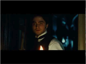
  • ·      The opening of the trailer shows old Victorian toys in an abandoned house. The lighting is dim and is unnerving for the audience as we cannot really see what the situation is - we are immediately shown that this is a trailer for a horror film. The trailer is unnerving rather than gory however so we can assume it is going to be a supernatural or psychological horror film (from the rest of the trailer we can gather it is a mix of both).
  • ·       The use of children in the trailer is a new stereotype of horror films - usual conventions of childhood is innocence and purity but horror films, such as the woman in black, use the unnerving image of a child who acts as an adult to unsettle audiences. 
  • ·      The lighting is used very well to add to the Edwardian mise en scene to create the horror genre atmosphere. Grey filtered natural lighting is used when outside to give a sense of being in a desolate place - the place is big but there is very little there. 
  • ·      The dark candle lighting inside the house is used to create a sense of the unknown- there is a constant enigma of what is in the house as we can see very little of the location- the dim lighting and the dark tailored clothes of our hero mean that in some shots we can see very little apart from his pale face. 


Sound
  • ·      There is very little sound with only the diegetic chiming of the old ‘musical monkey’ toy and the little girl talking non-diegetic voice-over; this creates the atmosphere for the audience and subsequently makes the audience easier to ‘make jump’ as we are having to focus very closely on the trailer to hear. 
  • ·      The rhyme used in the trailer is specifically written for the film - it creates the illusion that this is a real folk story that the villagers made songs of warning about; this is also shown through the use of the scratched photographs showing the ghost in the window such as you might see on a real documentary.
  • ·      The little girl’s voice is unnerving for the audience to hear a child talking about such a scary concept and the mature tone of the little girl’s voice is most unsettling because it subverts the media representations of children being ignorant to such horrors.


Editing
  • ·      The chiming of the child’s toy also is used really well to align with the cuts between the clips of the film- with each chime the screen goes black and then shows a very short clip of the quicker, I assume later parts, of the film without revealing the plot. 
  • ·      The panning shots are used well at the beginning of the trailer in contrast to the quick jump cuts later to create dis-equilibrium - the audience is given a sense of how the film will be in terms of how it will be based mainly around the anticipation of a ‘jump’. 
  • ·      The final, slower shot of the man looking out the window uses very little editing to create tension and anticipation for the ‘jump’ - after seeing the rest of the trailer we know this is a horror film and so the audience anticipates something happening. The woman appearing behind the man makes the audience unsettled and intrigued by the film as we cannot gather from the trailer what the real plot is. 
  • ·      The typography is linked very well the rest of the trailer. It is designed to look like someone/something has scratched into the glass. It is in a very old fashioned text to indicate this is a costume horror. It is similar to the font used on when the man finds the message ‘you could have saved him’ on the wall in blood and is shown at the window we immediately before saw him looking out of to show the audience that this is the main location of this film. 

  
Camera angles
  • ·      The eye-line shots create the sense we are actually in the situation with the hero of the film. This is appropriate for this genre particularly because most horror films aim to make the audience feel in the same situation as the victim - e.g. we do not see something until they do. This is directly linked to identifying the intended audience as viewers can clearly see this is going to be a classic psychological ghost story and will entice fans of this genre.
  • ·      Low and high camera angles are used throughout to give the sense that the character is being watched – these create an unsettled atmosphere as the camera angle implies that the character is not alone.

Gamer (2009) poster deconstruction

·         This film poster would be great inspiration for our film.
·         The background image of one man (the main protagonist) is shown which builds tension amongst the viewers.
·         The protagonist is looking directly at the audience, giving eye contact. This involves the audience and brings them into the film themselves, making them want to watch it.
·         The protagonists face is shown being distorted as the middle of his face is seen to have been smashed in the centre, forming a vertical jagged line down his face. This could represent two sides to this characters’ personality or that this character is on the verge of breaking down, or is being ‘broken’ by someone or something else. This could also indicate that the outside of his face represents one personality, whereas the small face that is ‘trying to get out’ of the black and white face is his contrasting personality. He could be trying to be someone else on the outside, whilst hiding his true personality underneath.
·         The colour scheme of the background is shown in black and white
·         The typography of the title is shown in block capitals and in the colour red. The colour red has negative connotations of blood, danger, death and destruction. This gives an ideal representation of the film itself, relating back to its genre of thriller.
·         The title is shown near the bottom of the poster, centred. This allows the audience to move their eyes around the poster, whilst also looking at other things shown on the poster, which also allows the viewer to get the image of the poster in their head, making it more memorable.
·         The tagline is shown directly underneath the title which also allows the audience to manoeuvre their eyes to find it, whilst looking closely at the whole poster.
·         The tagline is shown also in block capitals, mirroring the font of the title above. The colour is white which juxtaposes the genre of thriller to give a sense of innocence that this character and film might also represent – we have to watch it to find out how the innocence is portrayed.
·         The tagline is also shown as a question. This question is directed to the audience that is looking at the poster. It involves the audience so that they feel like they are part of the film themselves, therefore, making the audience want to watch the film.
·         At the very top of the poster, centred, is the main protagonists name shown in block capitals and also in red, which suits the scheme of the poster and relates to the thriller genre. This would also stand out and grab this actor’s fans’ attention, giving the film more popularity.

Canon 550d effects

The camera which we will be using allows us to create a variety of feffects even before post production, The following videos show some of the effects available to us when shooting our trailer.  It also shows the quality of the footage when the camera is used efficiently.


From the last video, we can see that the camera will provide us with high quality, proffessional looking footage, which is ideal for the look we want for our trailer.