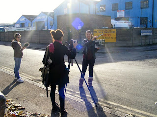
Friday, 30 November 2012

Shooting schedule: December

Because of the difficulties with getting actors and crew together on the same day, and also the issues with getting days with similar weather for continuity within shots, we had to do several shoots, below is the schedule for December.

Shooting Schedule no 4:

Crew needed: Summer
Date: 12th December
Actors needed: Drake (Dani)
Actor arrival time: 11am am meet at Summers house
Arrive at Destination: 11 am
Time allocated for makeup: An hour/
Begin shooting: 12 pm
Estimated shooting time needed: Two/three hours
Props needed: Makeup (fake blood and body paint for bruising, wounds etc.) costume and weapons fake rifle.
Lighting: LED lights
Sound equipment: (all)
Camera equipment: two tripods, Cannon 550D, Nikon DSLR (for photos)

Tuesday, 20 November 2012

Our final actors


We have made a final decision on our main actors in our film.

The following shows the profiles of our actors and their descriptions: 


1. Debby Voshart

Age: 25
From: London
Experience: Actor, Dancer, Musician 
About: Debby has had a wide range of experience from appearing in professional music videos to being a 'living statue'. 
Character: Nyla


2. Shen-Chien Tsai

Age: 28
From: London
Experience: Model, Actor
About: Shen-Chien has had a wide range of experience including participating in the London Olympics, the stage show 'Othello' and 'Romeo and Juliet', and starring in the film 'Hummingbird'. 
Character: Malory 


3. Farah Speer


Age: 18
From: London
About: Student
Character: Della


4. Curtis Stewart

Age: 17
From: London
About: Student
Character: Jesse


Filming: Day 1

Day: 1
Date: 18-11-12
Time: 10:00am - 2:00pm
Group Members Present: Danielle, Summer, Farah
No. of Actors Present: 1/6 actors


On the first day of filming, following our shooting script, we knew which scenes we wanted to film this day. Although, we were limited to one actor that day, which also limited our choice of scenes.


Filming

  • We filmed many shots of the actor including one where he is being chased and is running away, being trapped in a cellar through railings, and aiming and shooting a bow and arrow. 
  • We made sure we had more than a few shots on each section so that we can choose the perfect shots for our trailer. 


Location/Mise en scene

  • We chose to film the shots near a pub, as there were more mise en scene in the area that would be good for our storyline.
  • We included large bolders from a nearby park, which were good to portray being enclosed away from the outside world, and also for the actor to run and jump up on. This adds to the action of the trailer.
  • We noticed that there were many barbed wire around the tops of walls, which was a great find for us. We took this at our advantage and filmed this as it would represent the impossibility of escaping.


Character head-shots

  • We made sure we captured enough head-shots of the actor which would be useful when producing our poster and website. 


Props

  • We had a range of set-props we could use in the area that were naturally there, such as rocks and sticks which were used as weapons for the character.
  • As it is autumn, we noticed a vast amount of leaves and foliage around the park area and pavements. We used this to our advantage by ruffling the leaves to make wispy sound. We also filmed a shot of the actors feet, while running and being chased, which would make a good shot to use for our trailer montage.


Makeup

  • This was the first day we tried the makeup/facepaint on the actor.
  • We were very pleased of the outcome, as the makeup was subtle but noticeable and has a great impact on the scenes.
  • We used black and brown facepaints for dirt and scratch marks, and fake blood for cuts and wounds.
  • It looked very realistic and would be a great addition to our film trailer, website and poster.


Sound

  • We found and recorded a vast range of sound for our trailer that day. This included the rustling of leaves, screaming of the actor being chased, and clanging sounds from metal bars.
  • We used a voice recorder to record individual sounds so that we can add them onto each shot while editing in the process.


Complications

  • The majority of our set actors could not make this day of filming hence we only had one actor. Although, we worked around this issue by focusing on this character and making sure we successfully complete the filming and capture head shots for this character.
  • Throughout filming, delay was caused by cars passing whilst filming scenes on the road. This interfered with the camera work and also produced unwanted excess sound. 


What to do next

  • Next week, we will have more actors on the day of filming, therefore, we will be able to get more shots done.
  • We will focus on the character head-shots for our website and poster, so that all characters have a profile photo.
  • We will film many short shots of the characters running, chasing and interacting (fighting) with each other for the trailer.


Monday, 19 November 2012

Photoshop practice

I have never really used Photoshop and so I thought it would be a good idea to practice layering images and looking at what I could do before we make the typography for the film and before we start making the poster. Below is a test of how to layer two basic images. 


I layered the image of the zombie below over the image of a university lobby. This is the sort of thing we will be doing in the poster I think so its a good thing to practice. 


I layered the image over and then used the eraser tool to remove the background of the field and blend the image in. It was really simple so I think it will be good to use on the poster.

Tuesday, 13 November 2012

Costume - Men

I think it is important that the characters personality is shown through their clothes but also I think it's important, especially for the men, to have a uniform look to show the idea behind the story. Below is the costume I thought would be suitable for the men to wear as both the top and trousers are practical and plain. I think it would be a good idea if the shirt for Drake was more fitted to show he is more muscular than the character of Mallory who is meant to be physically much weaker.

Costume - women

I thought it would be a good idea to have all the characters in a type of uniform but with each character having some of their personality shown through the costume. Below are the women's costumes.

Strong woman:
I thought this character, as a seductive strong woman, should have a more fitted look to her costume as that would suit her personality more. I have opted for quite fitted combat trousers and a tight vest top.


Clever woman:
This is the costume I thought would be good for the clever woman role. The outfit is still attractive with a reasonably low cut top but it is a lot more practical than the other two outfits as it is slightly loser and more uniform based.


Peaceful woman:
This is the peaceful woman's costume. She has the same looser trousers as the smart woman but she has a vest top with some lace around the top to show she is more girly and doesn't want to fight.


Wednesday, 7 November 2012

Website layout research

Conventions of typical film websites


  • Videos - we can inbed our finalised teaser trailer onto the website which would give the audience easier access to it while finding out what the film is all about in one video.
  • Photo gallery - we will take multiple-angled photos whilst filming to input into the photo gallery section on our website.
  • Info about the film -example, how much it is, what it’s about etc. - the 'about' section would be shown in a tab on the home page also, for easy access for the users.
  • Promotion of the DVD etc. - we must state when the film would be released in selected cinemas etc.
  • Distributional Links - to facebook, twitter pages. This would show that our film info would be very distributional to grab a greater potential popularity.
  • Menu - to provide easy access and navigation throughout the website.
(menu from 'Fermats Room' website)
  • Text - The font must be suitable and easily readable for all ages but directly aimed at our target audience of males and females 18-30.
  • Title - This is essential to allow the viewers to know exactly what film's website they are looking at. It relates back to our typography in that it must be memorable and stand out for the viewer to remember and focus on it in the future.
  • Theme - Includes colour schemes and the genres conventions. It must relate to our film and include dark colours such as greys, browns and blacks and also bright but dangerous colours such as red, yellow and orange (to signal fire and destruction).
  • Sound - We can include sound in the background to build up tension amongst the website. This would make our film seem more professional and eye-catching. It would draw the viewer in by using the sensory system of sound aswell as the use of eyes to view the website.
  • Easy to navigate - This is essential so that the viewer does not get easily confused throughout the website and knows exactly where to find what they are looking for.
  • Don’t have to scroll down the page - This would be great because all the information that the viewer needs would be on the homepage in one sight, so that the viewer can monouver their eyes around the webpage without the effort of scrolling and looking for more info. This would be the first piece of info and data the viewer would see, therefore, would be best to have the most important information directly in eyes level as it would make a better impression for the viewer to find out more about the film.